Translation Identity
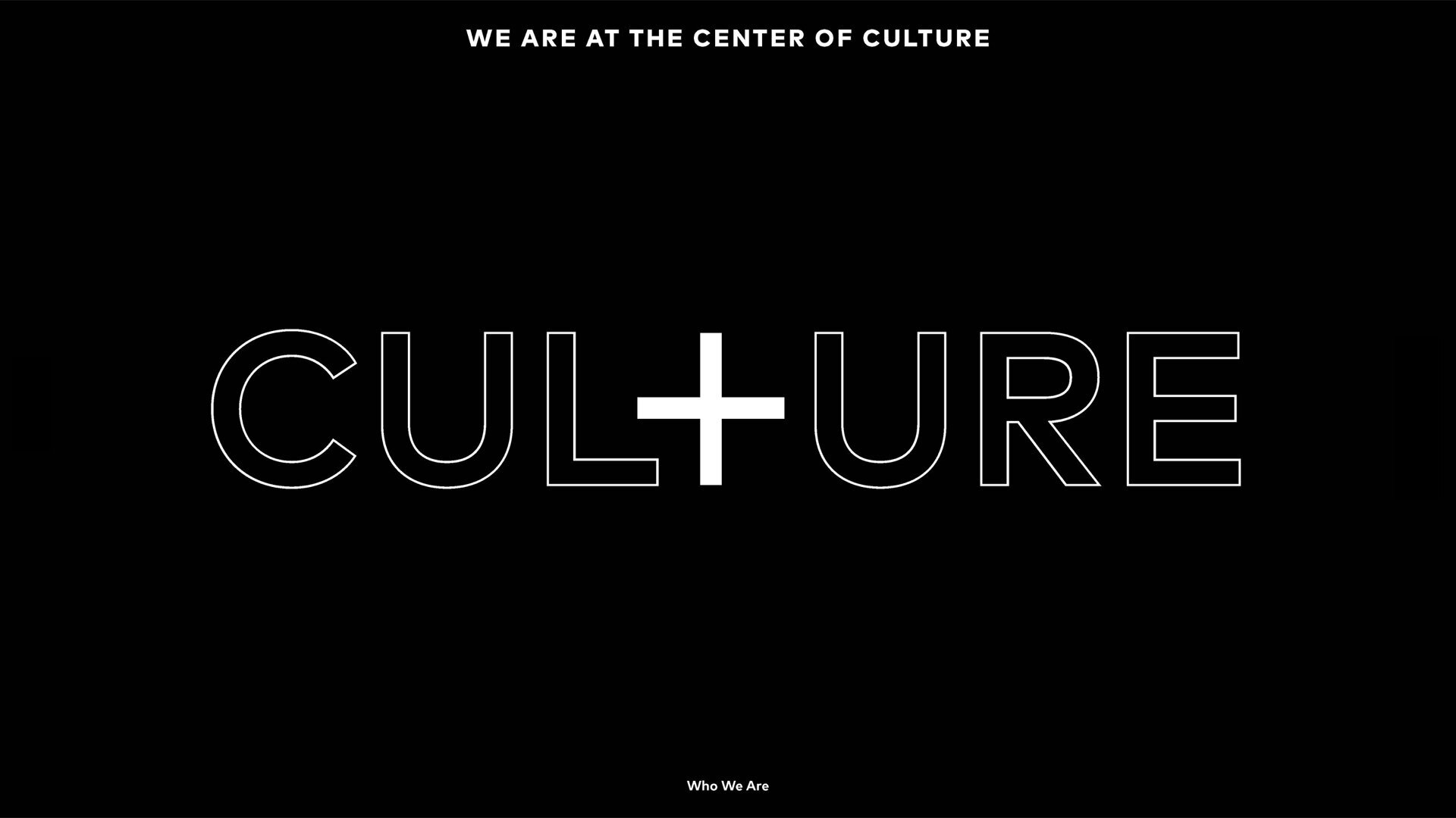
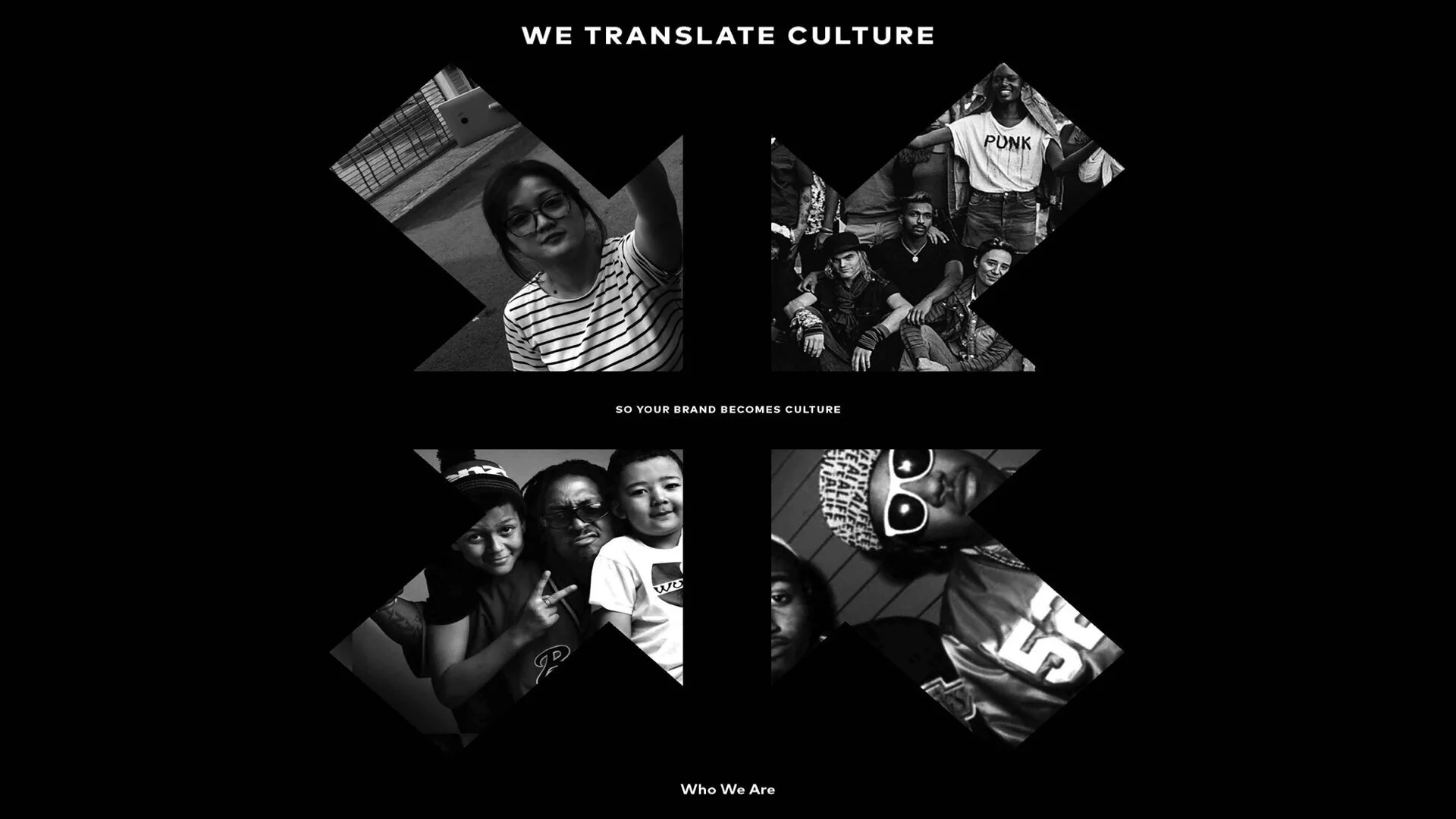
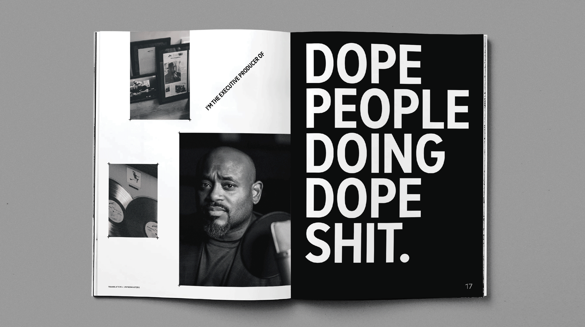
When setting out to rebrand Translation we needed the identity to help connect a unique mix of experts in culture, technology, and storytelling. Leveraging the “T”s as iconic plus symbols we were able to literally connect the passions and talents of the people that make up and drive the company. The new visual language became the center of communications, beliefs, and a new culture book to define the brand. Additionally, the DNA of Translations new ID also directly connected the brand visually to it’s sister company UnitedMasters — creating balance and visual convergence between the brands.